- hello@bertagency.co.uk
- 0161 452 0052
About PFK
Founded in 1867, Penrith Farmers & Kidd’s has matured into the largest independent property group in the UK’s Lake District.
Alive to the threat posed by online estate agents and challenging market conditions, Penrith Farmers & Kidd’s approached Bert for a brand audit to assess a proactive response.
Disciplines
Brand Identity
Narrative + Strategy
Communication
Art direction
The Process
Bert’s Clarify process exposed strong local brand recognition, good penetration and a positive awareness of the company’s core services, but it also highlighted that a potentially lucrative audience sector was being turned off by the company’s outdated image, that regional, national and international markets remained untapped, and awareness of the company’s broader service offering was low.
Outcome
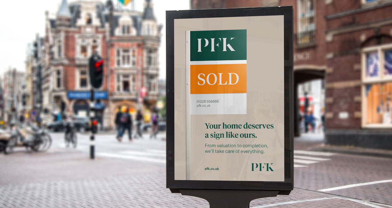
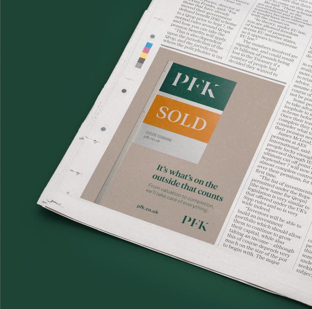
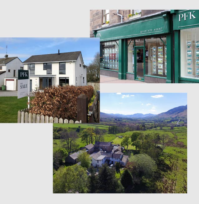
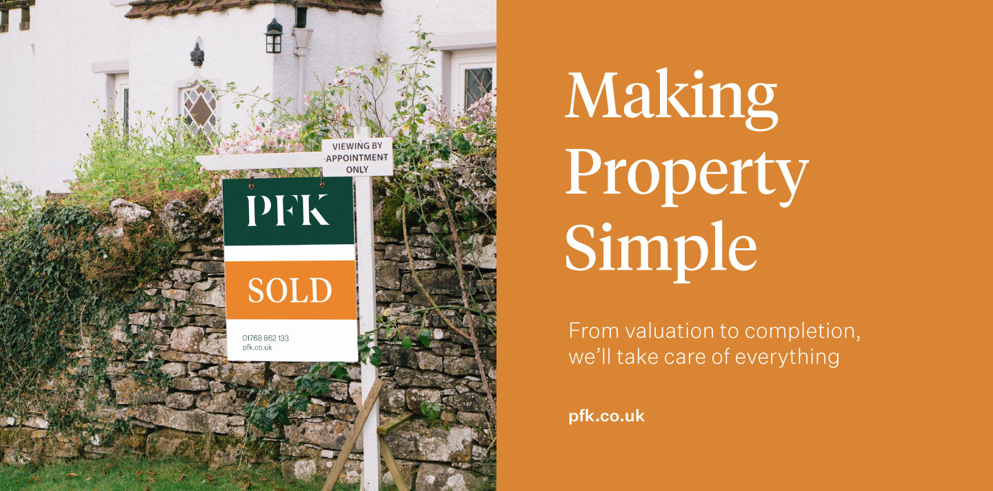
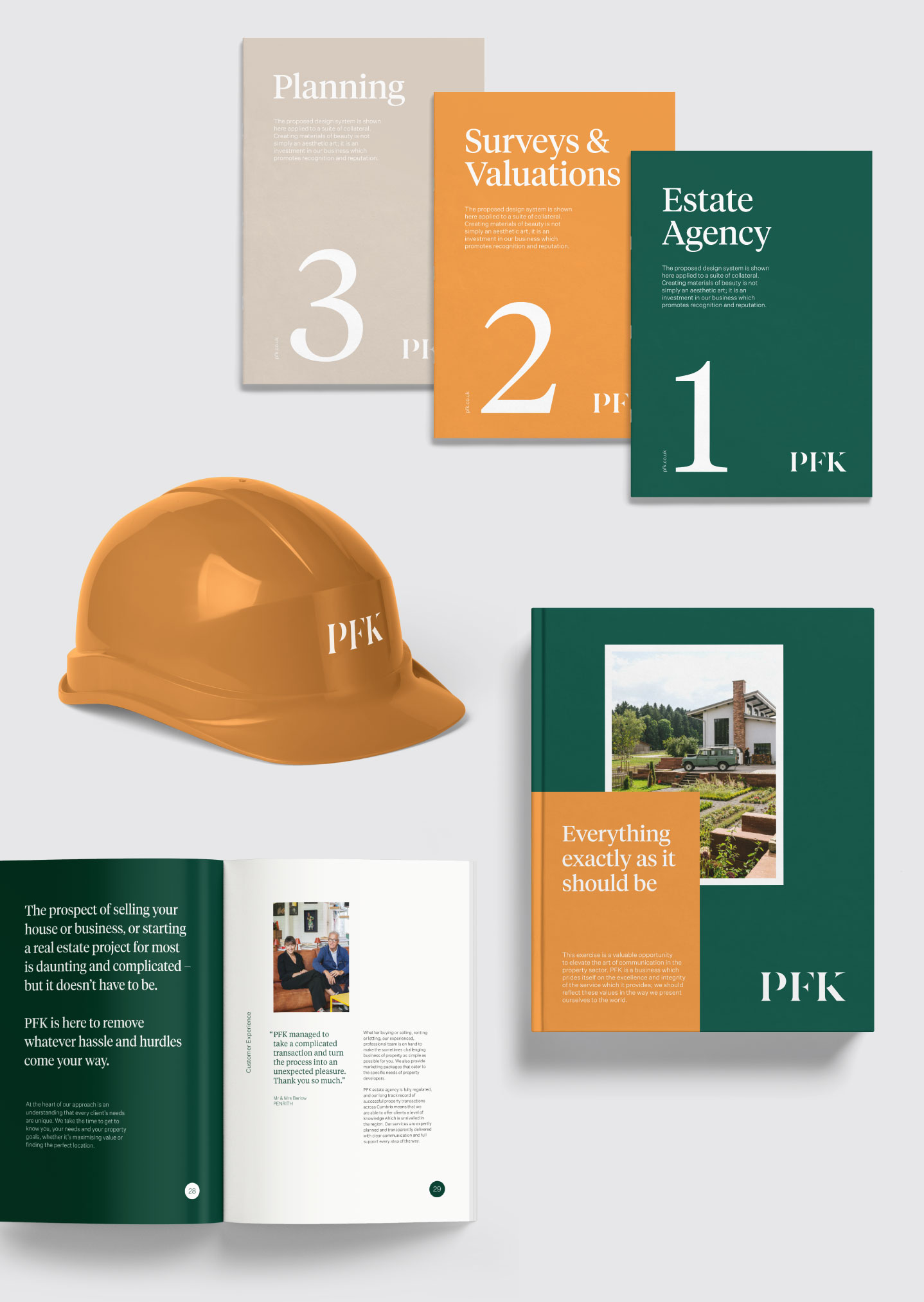
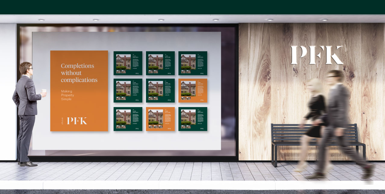
The completed identity was executed across adverts, film, store redesign across nine sites, signage, print and the new corporate website with a fully integrated cloud property management solution.
After over three years of declining residential property viewings and sales due to the tough economic conditions, the rebrand launched. The proactive and positive stance PFK has taken made an immediate impact on public perceptions, with viewings up 63% and sales up 41% year on year. PFK also won the UK’s best estate agency marketing award at the International Property Awards for the PFK Platinum service, impressing the judges with its innovation.
Bert continues to work with PFK to help maintain its profile as the leading property group in Cumbria, move the brand forward, and create innovative property solutions.
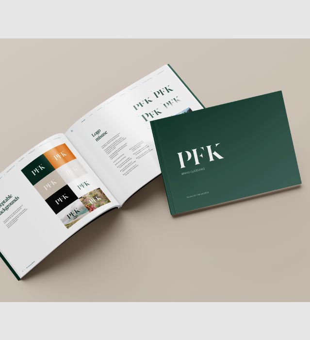
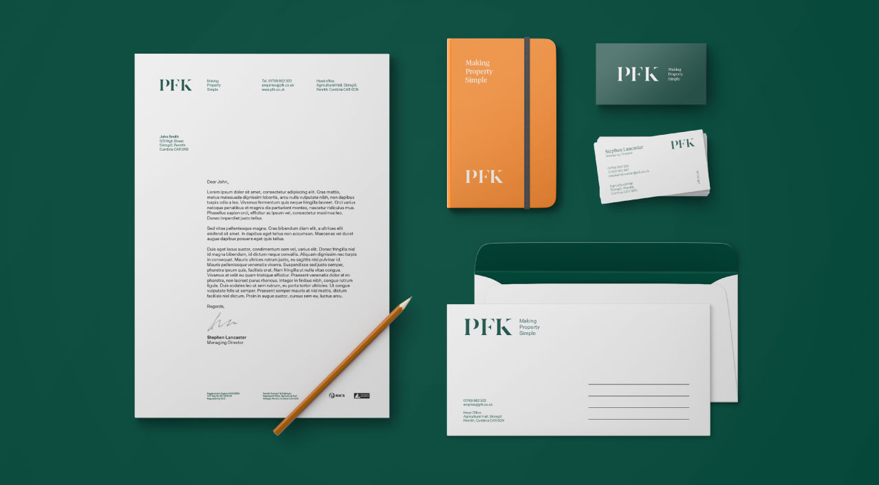
Narrative ID
We condensed the lengthy company name ‘Penrith Farmers & Kidds’ to PFK. Research revealed this acronym was already preferred and used by almost all audiences. The domain pfk.co.uk was secured and this stronger name became central to the brand.
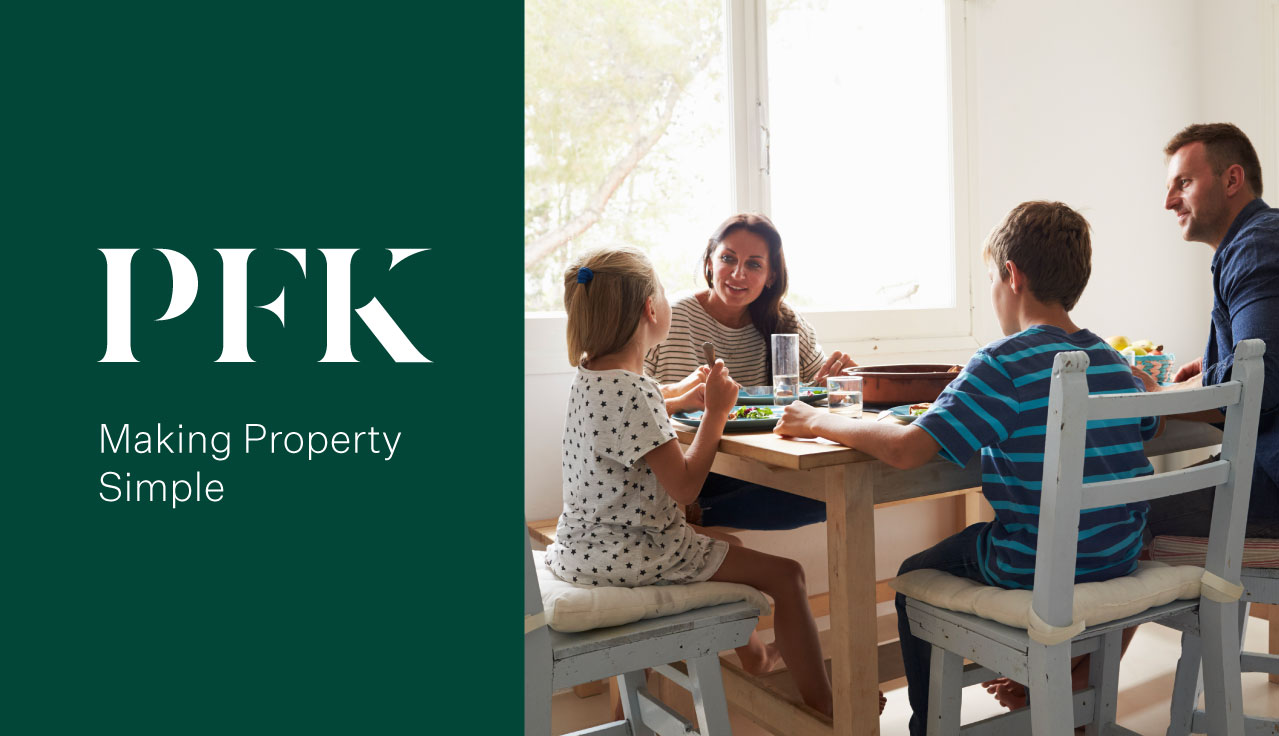
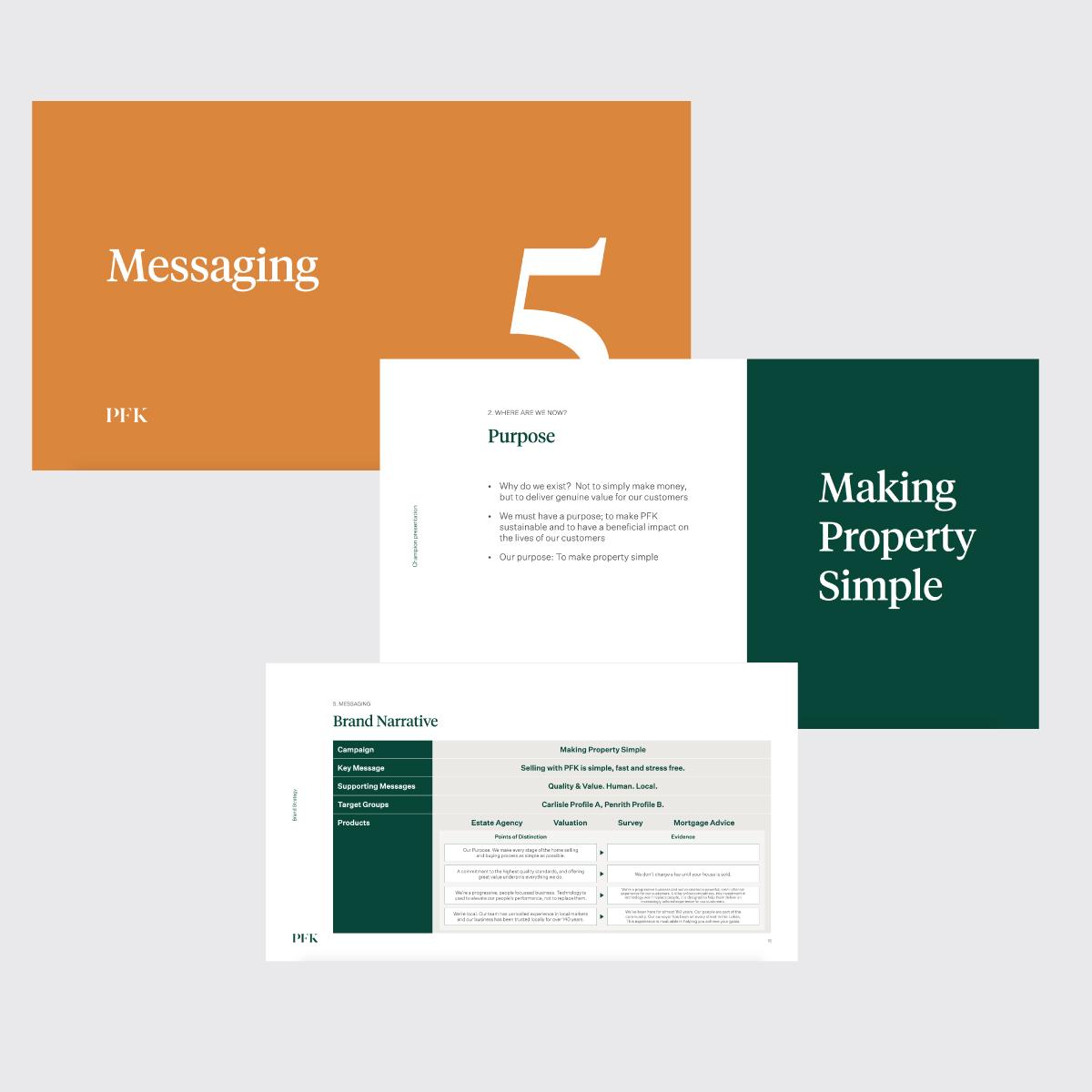
We created the narrative identity system around a new overarching purpose, ‘Making Property Simple’. This was supported by new company values, revised propositions and a clearer tone of voice supported by a PFK lexicon, which simplifies everything from estate agency to digital marketing terminology.
The purpose has gone on to shape service provision, simplify customer experience and has also been the central idea underpinning all PFK marketing.
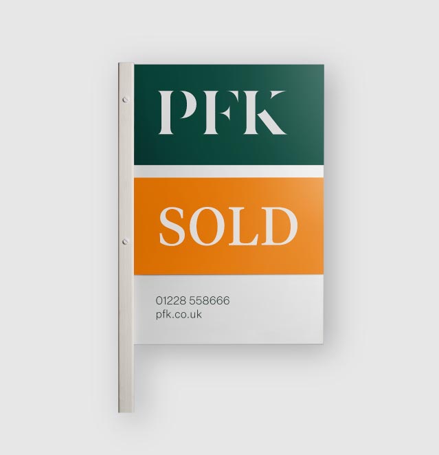
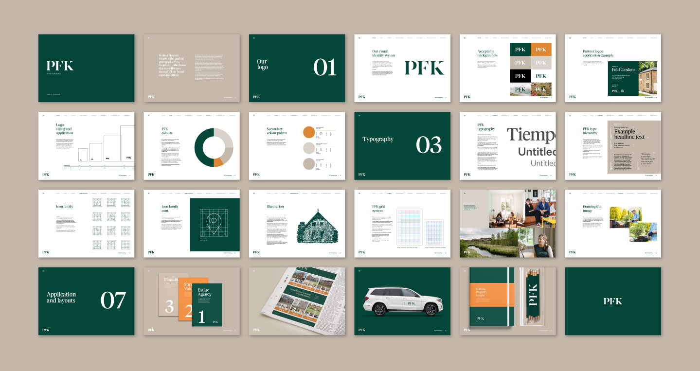
Visual Identity
The visual treatment had to strike a careful balance; respecting a rich heritage and almost 150 years of equity with a new visual identity that would appeal to an increasingly transient, cosmopolitan and tech-savvy audience.
The process centred around building on the serif wordmark that had been in place for over a quarter of a century, crafting it into a new, modern mark that retained the essence of the company’s rich heritage. We also folded in existing PFK sub-brands to construct a single identity across the PFK group.

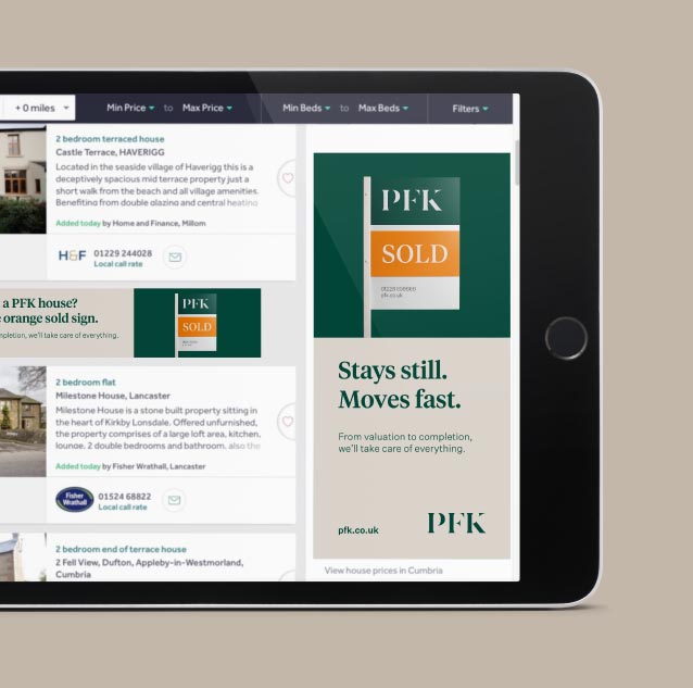
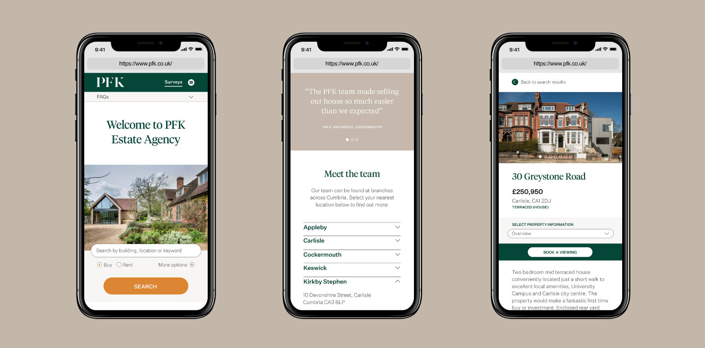
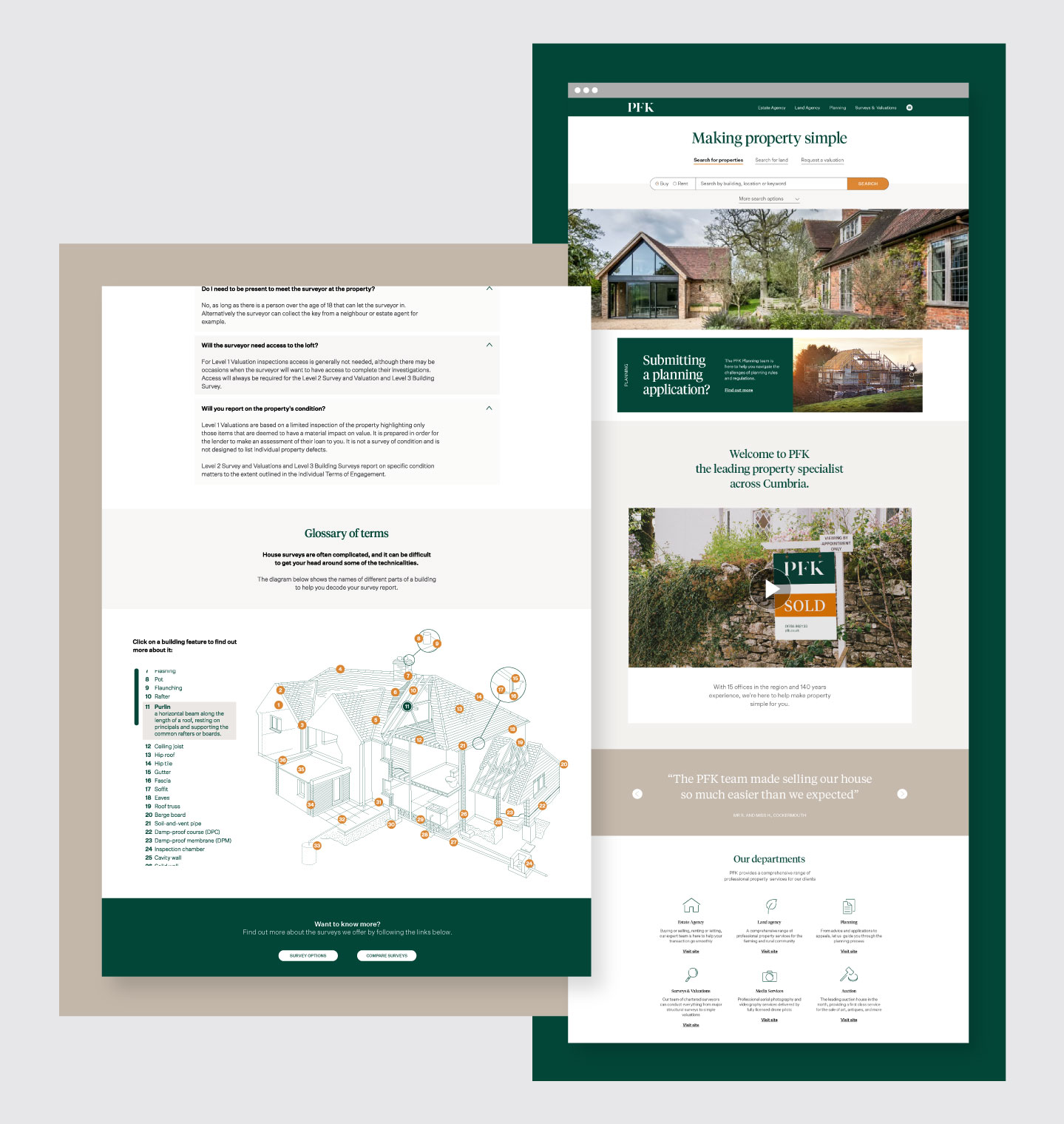
Digital Experience
We helped PFK bring several digital ‘firsts’ to the UK, one of which includes the international award-winning PFK Platinum service pioneering the use of drone helicopters to take aerial HD videos and images for the benefit of buyers and vendors.
We also designed and built the PFK property website and group corporate site. The property site integrates with Rightmove, Zoopla and PFKs internal property management system, meaning property updates made from any of PFKs 8 offices will be automatically added to the site and third-party marketing platforms.
Advertising
The new purpose ‘Making property simple’ has been adopted throughout PFK at all levels. Both teams and employees all strive to make every layer of the organisation, and every-stage of the property transaction process as simple and stress-free as possible. We brought to life through PFKs through-the-line marketing campaigns, which made the brand itself the hero, and simplicity the lead proposition.
With viewings up 63% and sales up 41% year on year, the investment has already paid significant dividends.